We now know that the Covid mRNA jabs that were mass injected into the world population were not even close to the experimental mRNA jabs studied under the unfinished Phase 3 clinical trials by Moderna and Pfizer.
The former have more varied “dirt”, and much more of it in them due to the very nature of mass production (Process 2) as compared to the lab-centric cleaner and more controlled, much smaller production scale, trial jabs (Process 1):
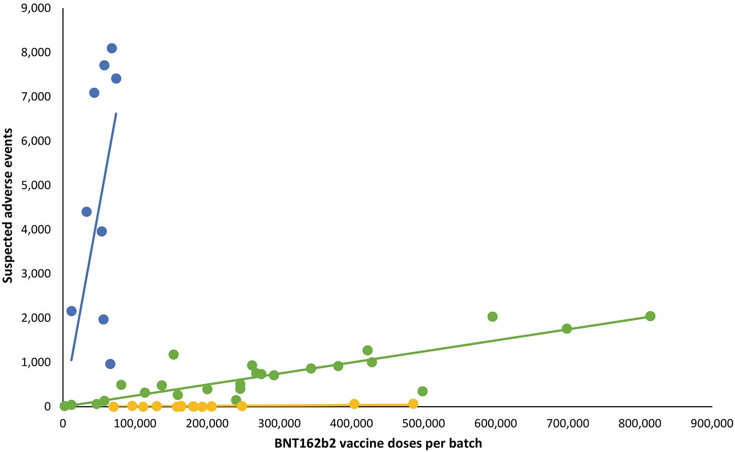
With that in mind, we also know that some of those Process 2 batches were much more contaminated than other batches, e.g. “Batch-dependent safety of the BNT162b2 mRNA COVID-19 vaccine” (Wiley, 2023.03.23):

And a single batch could be millions of doses large. And these batches were distributed unevenly around the globe by “vaccine” manufacturers. I.e., some countries could have received more toxic batches while other countries could have received less toxic batches.
So, let’s test this working hypothesis and try to figure out if indeed there were the more lucky countries and the less lucky ones, in this global game of Russian roulette.
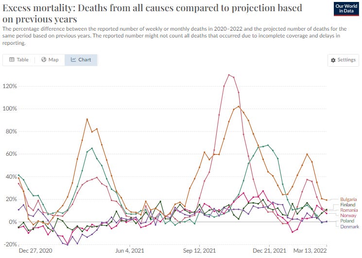
I would like to use these 6 countries in my test run: three from Eastern Europe and three Scandinavian ones, from the start of mass “vaccinations” to about Apr. 2022 (the end of the Omicron wave). Let’s first look at the excess mortality numbers:
We can clearly see horrendous excess mortality in Eastern Europe while not much, comparatively speaking, is happening in Scandinavia. For added clarity, I will split the above graph in two separate graphs for the two regions (pay attention to the 6x larger scale in the graph on the left):
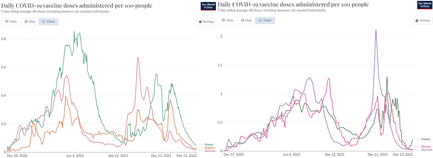
What was going on with “vaccine” uptake at that time? Glad you asked! As it turns out, Scandinavia was hitting Eastern Europe out of the ballpark with its shots in the arms:
After splitting the above graph in two separate graphs for the two regions (pay attention to the 150% larger scale in the graph on the right):
The CDC-preferred explanation may be this: “Sure, Scandinavian countries protected themselves with a healthy uptake of exceedingly effective and completely safe Covid vaccines, while the Covid waves literally decimated the less enthusiastic backwater Eastern European countries.”
Except, we see a positive correlation between the “vaccine” uptake and excess mortality among these Eastern European countries. The most-vaccinated Poland had many more excess deaths than the least vaccinated Romania in the first vaccination drive. It seems like Romania took the CDC interpretation close to heart and tried to compensate in the second vaccination drive, in the second half of 2021, only to become the excess mortality leader - couldn’t pull off the Scandinavian result no matter what. Hm…
We can also discern a clear correlation and time proximity between the amount of “vaccines” in the arms and the number of excess deaths shortly thereafter, in Eastern Europe. It’s as if the “vaccines” in the arms were killing the vaccinees. One could go as far as proclaim that Eastern Europe was consistently getting much dirtier batches than Scandinavia. How preposterous!
Eastern Europeans didn’t like the results one way or the other, and developed a strong aversion to further jabs, a.k.a. boosters. So much so that Scandinavians beat the Eastern Europeans by more than 2:1 in the number of shots per person:
Instead of protecting the lucky Scandinavians even further from the ravages of Covid, long or short, the mortality numbers have reversed. While Eastern European excess mortality reversed the trend and dropped precipitously ever since they just quit the jabs, the Scandinavian excess mortality keeps creeping up, cleaner jabs notwithstanding:
The last 12 months produced a starkly contrasting excess mortality pictures in these two regions:
Instead of Eastern Europeans succumbing to the delayed effects of Long Covid, (myocarditis, pericarditis and other deadly conditions), as the official line holds, the Covid-overprotected Scandinavians keep dying in excess numbers instead. Isn’t that a surprise?
Maybe I just misconstrued the whole thing? Please let me know what observations and conclusion do you make from the above graphs.
P.S. 2023.10.26. Upon further reflection, we can spot an example of a country that was first served clean jabs only to be served dirty jabs from July 2021 onward. I have wrote this post back in November 2021:
Falling into Place Like Dominoes
CORRECTION: After further analysis in “Exposing THE EXPOSE”, it has turned out that the apparent 5% of bad lots is an artifact of CDC/FDA scrubbing the VAERS database of deaths and serious adverse events. Which means that the other 95% are not harmless either.
The Australia’s deaths vs jabs correlation show two distinct periods - before and after July 2021:
The issues with Process 2 that surfaced recently, may explain neatly this pattern.
P.S. 2023.10.27
Also, Peter Mccullough has something to add to this topic:
And another shoe dropping with a thud (30 dead from the same location, same day jabbinations) in NZ:


"Experts are baffled."
The last graph is what left me gobsmacked. That one is the one that drives the point home. Utterly. Undeniably.